
Fleet
Medical Corps Pins
by Rear Admiral
Manitsas #295
 |
 |
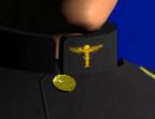
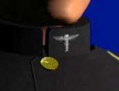
| Ship’s Doctor Pin | Flight Nurse Pin |
In the year 2000 with the permission of Grand Admiral Ronin, Admiral Michael (now Fleet Admiral Michael Tolwyn) founded a unique sub-group with membership in all the subgroups of the Emperor’s Hammer to organize the scattered medical officers of the fleet: The Fleet Medical Corps. Admiral Michael took the position of Chief Medical Officer (CMO). His assistant was the Executive Medical Officer (XMO). Each subgroup in the Emperor’s Hammer would have a medical corps run by a Principal Medical Officer (PMO) and a Principal Nursing Officer (PNO). A Senior Medical Supervisor (SMS) and a Senior Nursing Supervisor (SNS) would supervise various divisions (such as the Battlegroups, the SSSD Sovereign, and the SSD Avenger). Each unit or ship would then have a Doctor (DOC) and a Nurse (N).
As you can see, the sudden proliferation of medical ranks necessitated a method of differentiating themselves on their uniforms. Up until this point, the Ship’s Doctor’s Pin would have sufficed. Now, there came a flurry of iterations. One scheme used two pins on everyone’s collar, of varying colors such as blue, red, purple, gold, and silver. When they were sent out over e-mail, my reaction was that they were “butt ugly” in every respect. In addition, there was no way to differentiate the positions without a scorecard.
At the same time, there was a competition in the FMC to fashion an official FMC dress uniform. Again, puke colors prevailed. Rejected uniforms included lime green, sea blue, and fire engine red. Again, the positions were denoted with multiple (up to seven) caduceus on each breast and the collar, with mismatched colors in some of the rejected submissions. I even entered the competition with a white version of male and female FMC uniforms with gray trousers, a black belt, a silver buckle, and a gold stripe down the sleeve. I was struck by the haphazard use of decorations, especially the practice of adding caduceus after caduceus. The entire project seemed doomed, as the methods used were confusing at best, ugly at worst.
| <<< Page 1 |
Page 2 |